|
Vader Helmet Comparison -
Revenge of the Sith to A New Hope
|
 |
| The eighteen year gap in fantasy terms between Revenge
of the Sith and A New Hope was in reality something like a 27-28
year difference between the time when Brian Muir sculpted the wonderfully
asymmetrical Darth Vader in 1976 and xxxxx produced the more symmetrised
equivalent for Sith in 2004. I know its only us die hard fans that care
about these subtle differences but how come the later helmet looked less advanced?
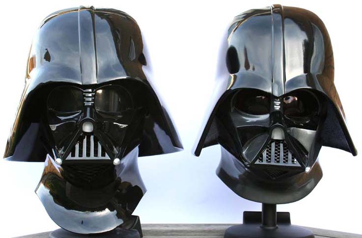
Anyway, on to the pics. For this comparison I've used MR's excellent
Vader helmet from the new movie (left, like you need to be told), and Ghost
Host's equally wonderful ANH helmet on the right. |
 |
| The sculpture process for the RotS Vader was a complete
departure from the "reuse what you've already got" mentality which was used
used for the Original Trilogy. For Sith, the sculptor cast parts of an
original Vader, such as its left cheek - and then built up the finished
piece from these building blocks. Below a nice shot showing the
chronological "before and after" |
|
|
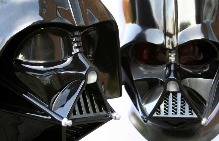
| So looking at the face the most obvious thing that first stand out
(apart from it lacking the OT's alternating grey and black colouring) is the symmetry
of the new RotS helmet, such as around the mouth and cheeks |
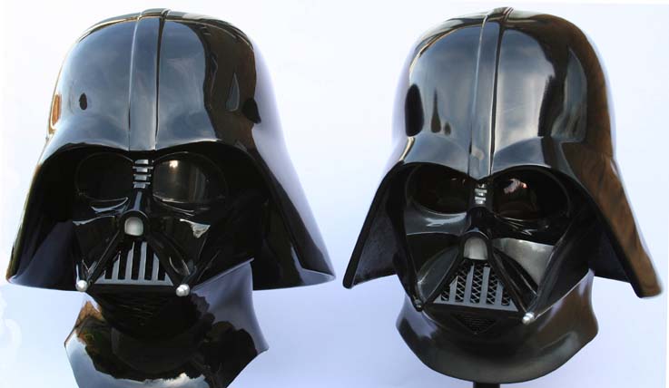 |
| IMO the ANH just looks more meaner for all its lop-sided
irregularity. The way the widows peak juts down between the eyes, with the
dome just hiding the tops of the brows gives it a much colder look. |
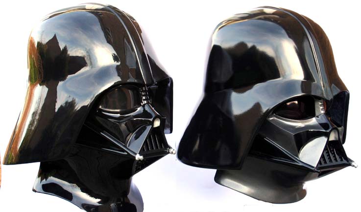 |
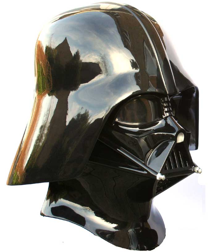
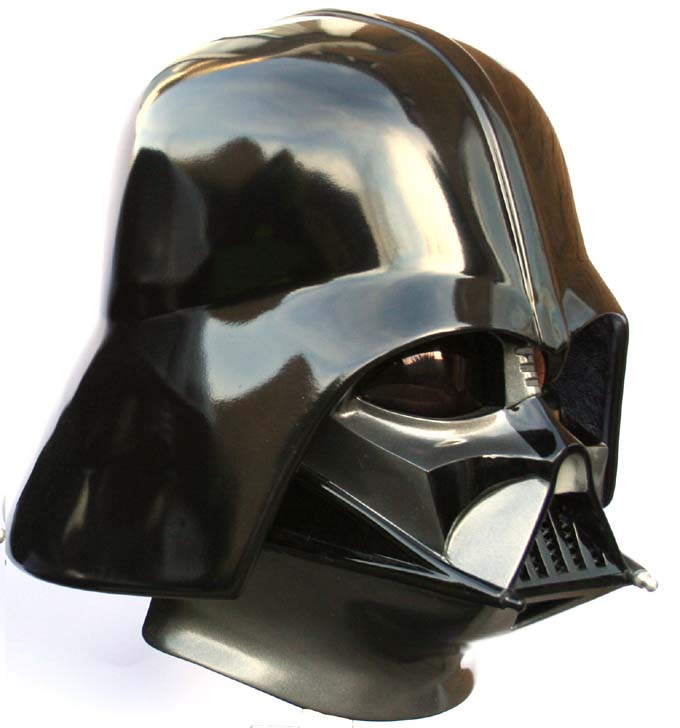
| From the side face of the RotS helmet shows more
similarities with the ANH, although the dome is significantly different, the
centre strip significantly wider and the base of the dome more flared |
|
|
| I thought I'd add these shots above and below showing the
two helmets full screen. I've literally just cut the pic in two so the
lighting and size for both should be the same. t |
 |
| |
| |
 |
| I do like the extended neck on the Sith variant, although
the flatter lenses for some reason just don't seem as mean as the OT
variant. Funny that this is completely the opposite affect as the
Stormtrooper where the flat lensed Stunt helmet looks IMO meaner than the
bubbled Hero. |
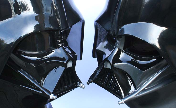 |
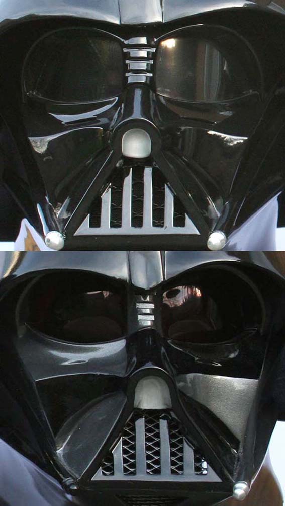
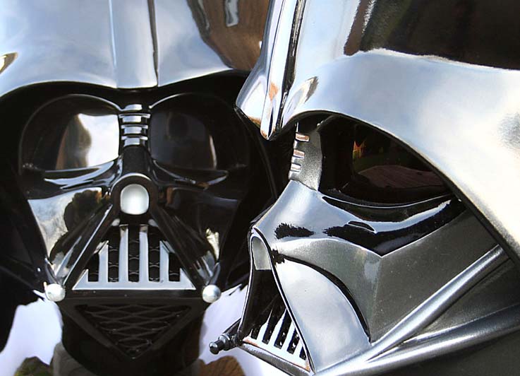
| Close up of the "nose" and "mouth" areas. The check dents
under the eyes are a lot more pronounced on the Prequel helmet, however all
the curves match up showing (if we didn't already know) that this is not a
totally new sculpt. |
 |
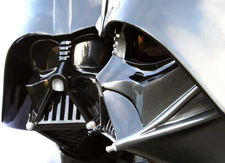
| Next a couple of ABBA shots with the ANH lookong
straight-on in the photo above, and the RoTJ straight on in the photo below.
Knowing me knowing you, aha |
 |
| It would have been interesting to see a version of the RotS
helmet in the Black and Gun Metal Grey. The ANH Vader was originally
designed as an all-black affair, with the grey highlighting added when they
realised just badly it looked on-film (the all black looking washed out).
For Sith they were able to get away with an all black helmet although did
used different shades/finishes. |
 |
|
For a closer look at the MR RotS Vader Helmet
go here
For the ANH Ghost Host Vader go here
For
the Comparisons Menu go here |